These are overall really accurate depictions of what life in UX is like.
I do have a comment on this one:
> “Users don’t read”
> An overly used argument to convince clients and stakeholders to cut copy length in half. If you made this far to this article, you’re living proof that this statement is untrue.
The real principle here is that users don't read anything that doesn't look like it will help them do what they're trying to do.
In the case of the article: Sure, I read the article, because I wanted to read the article. But notice I didn't read the titlebar, the subtitle, the author, the nav, the footer, the newsletter subscription form...
Someone reading copy probably wants to know something about your product. Depending on what they want to know, they might skim around the page looking for the most relevant thing – for instance, looking for a header named "Specs" when trying to find battery life.
Making your copy shorter will certainly make that task easier and save their time, and it'll probably make it less likely that they'll decide they didn't want to know things about your product that much.
Honestly I skimmed the first part of the article and then checked the comments. It may be a design cliche, but it may be true. I didn't make it to that part.
I also go to pre-release media screeners of movies - you wait in line for a while, and you get to see a movie a few days earlier.
Anyway, the most recent movie pass (Detective Pokemon, really good by the way) had some red text in the middle. You had to redeem the pass for tickets at the theater before the screening, not wait in line. A LOT of people, including my movie buddy, did not read that red text.
If you depend on your users to read something, you will be let down very often. If you depend on your users to read, you should back that up with some check.
I am not a designer nor a software engineer, nor a business person. I am just a (heavy) user of all sorts of software for a very long time. I am a competent coder, and I code for research and pleasure. I don't have a dog in this, let's say, professional race.
Every time I spot "UX" in relation to something I use, I cringe. Not because I have anything against the idea of design, or good interfaces, or designing good interfaces. That is all great. The problem is that 99% of the time that the term "UX" shows up in connection with something I use, two things are going to happen:
1) I will have to relearn how to do something that I already was used to doing without even thinking;
2) Some feature or option is going to be removed.
The human brain is incredibly plastic and adaptable. Unless the interface is truly absurd, most people can get used to it and never give it a second thought again.
My number one (by far) request as a user:
DON'T FUCKING CHANGE THE INTERFACE
Unless there is a very good reason, and I bet there isn't.
I bought my first MacBook in 2007. Thankfully, Apple is one of the best behaved companies when it comes to not changing things for the sake of it, and part of the reason why I stick with them. I don't mention this out of some sort of fanboy-ism (I have no loyalty to corporations, I just buy shit I like). I mention it to make a more important point:
The UX of 2007 was absolutely fine, and if they would have made zero changes since then I would be perfectly happy. UX for laptops/desktops was solved in the early 2000. Everything else since then is just irrelevant bullshit.
This is not true: "The human brain is incredibly plastic and adaptable. Unless the interface is truly absurd, most people can get used to it and never give it a second thought again."
I've interviewed and observed enough users to know this is not true. There are a lot of interfaces that are suffer from issues with discoverability and understanding, and even when a user figures this stuff out one time (or is showed it), the interface is not memorable.
One huge mistake you are making is that you are a power user. You probably use computers more than most people and understand interfaces and paradigms better than most people. I implore you to actually observe real users using real products.
> There are a lot of interfaces that are suffer from issues with discoverability and understanding, and even when a user figures this stuff out one time (or is showed it), the interface is not memorable.
Oh, dear, God, yes.
The "hamburger menu" is one of the worst travesties of the modern age.
What's wrong with the hamburger menu? It seems like a good compromise of quickly accessible functionality for little screen real estate. For desktop apps with plenty of screen real estate it's crazy (looking at you gnome) but on mobiles it's fine, especially when the alternatives seem to be some sort of hidden and undiscovered slide out menu or long button press.
I'm reading this on Firefox with a hamburger menu. It's a hard sell that someone else's supposed damaged discoverability is worth me giving up screen space to replace it with a menu bar for things that are rarely used. If they can't work out to click on it, they're not going to find much use from the things that are in it.
Either you'll translate the contents of the menu anyway and take care of this or you won't and having a universal icon to access an English only menu doesn't help.
Then again, if your users are using your software many hours a day, day in day out (e.g. in work context), they are power users due to circumstances. If you treat them as regular "common denominator" users, you're actually and directly hurting them.
This. I may be biased as a designer, but I definitely prefer products with better UI if it performs similarly. I'm a firm believer in no matter how great your product is, always invest in good design.
UX for laptops/desktops was solved in the early 2000.
In the early 2000, my music library was a few dozens GBs played back using mpeg123 or something. Nowadays it’s a Google Play Music subscription. Things have moved to the cloud, a lot. That’s a huge change in how computers work, requiring some serious UX changes. I too hate gratuitous UI changes, but things need to keep evolving.
Spotify and Google Play Music are a kind of worse version of UI of Foobar2000, with much limited features. There was a huge UX regression coming with the move to the cloud. I'm all for things evolving, but it's better if they don't devolve.
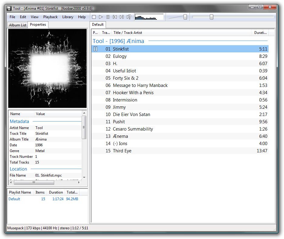
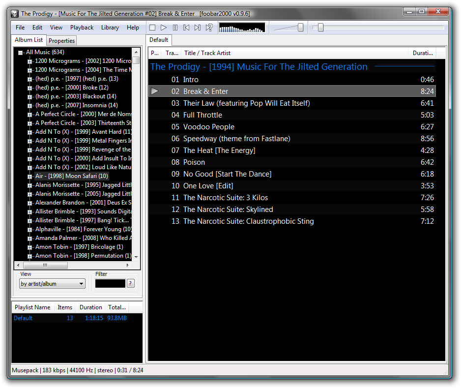
For power users, maybe. When I open a music player the first thing I'll do is search for something, and there's no search box at all here: https://www.foobar2000.org/images/img/main.png
I'm sure there is a way to search, but I think Foobar is maybe built for a different kind of user than Spotify, etc.
See that Filter box? That's a search that, within the scope of your music library, works better than Google's or Spotify's. It's an incremental search box (I believe web kids call that "Instant" nowadays?), that filters the album list by your search about as fast as you type.
I don't think it's built for "a different kind of user" - Spotify UI is pretty complex, because everything from search to managing playlists presents you with a pretty noisy UI that makes you click around a lot to find what you want and not click on what you don't want (Foobar never "suggests" you music it fully knows is not what you're searching for). Being a user of both - having switched to Spotify when it became easier than bringing an external drive full of MP3s to work - I can tell the basic UI interactions are of similar complexity, except Spotify is a bit more confusing at times.
Foobar's incremental search is such a useful feature I ditched Winamp for it back in the old days, and I still use it as a go-to example in product/UI development sessions.
> There was a huge UX regression coming with the move to the cloud.
Maybe in terms of the things you can click and knobs you can twiddle, but moving my music into Google Play and off (e.g.) iTunes means that I can very trivially put music on my mobile device (using either that device, or the computer) that is almost instantly accessible offline, and easy to listen to.
That twin gain - ease of sync and offline availability - completely blew Winamp and iTunes so far out of the water that they're in orbit, as far as I'm concerned.
(There are things I miss; multiple genres for a given song/album. Organizing by folder and playlist. Visualizations. Sometimes Google Play will forcibly replace my uploaded files with the wrong version - I still have a few songs that are "censored", and it grates me whenever I hear them.)
As somebody paying for Spotify, I agree. As somebody who had a MP3 collection on his disk in the 2000s, I disagree. Without doubt, my wifi connection should make it easy and fast to synchronize music between my laptop and smartphone. Nevertheless, "moving to the cloud" favours a centralized setup. Thankfully we see more decentralization on the horizon.
With music (and videos, and games) there's also another angle that I believe is in big part responsible for the success of Spotify and similar services: they provide an alternative between the only two options people had before - either spend a lot of money buying music in unwieldy formats, or acquire MP3s from copyright infringers.
I totally agree with you, there should be a self-hosted option. I'd love it if the Google Play API was sufficiently reverse-engineered to just install a modified version of their software to point to my own server.
I've asked for open-source/self-hosted solutions before, and a few people here responded. One of the solutions looks like it promises to do what I want, though I haven't had a solid chance to look at it: https://news.ycombinator.com/item?id=19555899
> I too hate gratuitous UI changes, but things need to keep evolving.
That's devolution in multiple ways. Your app is now tied to your subscription so there's no competition for best music app. The apps are now high latency bandwidth hogs that require a network connection. Your now held to ransom, stop paying us and you lose your entire music collection.
> I too hate gratuitous UI changes, but things need to keep evolving.
Do they? Once something is a tool that meets a need, should the default assumption be that any change can be justified by vague appeals to "evolving", or should there be some specific and defensible justification required beforehand?
In the 1950s, cars were made of steel and essentially designed to survive impacts by sacrificing the passengers. These days, they're identical fiberglass mice which fold up into a protective cocoon around their passengers on impact. You know how people drove cars in the 1950s? Steering wheels and some number of pedals. You know how people drive cars now? By calling an Uber, the drivers of which use steering wheels and some number of pedals.
So... why hasn't the fundamental UX of the automobile evolved in the past half-century?
The move to webapps meant that each app had to decide how their buttons would look like, what colors, fonts, and contrasts they’d use, how their workflows to do very similar things would be structured; when things were on the desktop the OS UI elements made all the decisions for you - it was the same gray buttons with black text in the same font on every app - the only difference would be whether the buttons were above or below the textbox...
Another reason is that apps need to look and behave roughly like what’s currently “in trend”, as users spend the majority of their time on the big players’ apps, and not “keeping up” will make your app seem outdated and untrustworthy; ie skeuomorphism was the thing when iOS first caught on, and then everyone had to make everything flat when material design caught on...
> DON'T FUCKING CHANGE THE INTERFACE
>
> Unless there is a very good reason, and I bet there isn't.
>
> I bought my first MacBook in 2007.
Apple changed one of the most common operations: double-clicking a folder to open it now (a) opens in the parent folder's window, and (b) rearranges the folder contents which I have carefully arranged for my own particular use of that particular folder ARRRRGGGGG.
They could at least have put an option somewhere for "Open folders the old way," but didn't.
Cmd-double-click does it the old way... unlike double-clicking on any other thing in the UI.
As a like-/counter-anecdote, I developed semiconductor CAD tools for 10 years, after spending 10 years using them. When they first started being developed with GUIs, GUI meant UI, and its oft-maligned sibling, UX, wasn't a term. In my learnings, Xt (XToolKit) started putting words and code behind the abstract patterns in the late 80's, but our tool usability suffered horribly as more and more (usually nonresizing) Athena widgets were crammed into every goddamn corner of the screen with microscopic b&w pixmaps. Because of the lack of distinction between UI & UX in the tool design process, tools were extremely challenging to navigate with each new feature-rich release.
One of my first tasks as a project manager in 2004 was to introduce the web concepts of UI/UX into what had become essentially commandlines converted to Tcl/Tk (after Xt we went to Tcl/Tk.. ugh).
First challenge was to convince the old timer CAD devs.
Once I was able to explain there the difference between UX and UI, it waslike a light went on over everyone's head: how you use it is different from what it looks like. I know, obvious now, but not 15 years ago. We spent 10 months really driving the new buzzword UX/UI in order to get buy-in for profiling how the top 3 existing CAD tools (formal verification, layout, and timing) were being used via instrumentation and interviews. We then proceeded to completely redesign the GUIs in Qt using a consistent set patterns, icons, and workflows.
Then we had to convince the old timer engineer users.
We put a lot of effort into classes to explain how to migrate, and holy shit did we get yelled at. So much "It worked fine before, why did you change it?!?!?!?" Uhh... because a feature you use 80% of the time required 5x more clicks to get to than a feature you used 20% of the time? FML. It got better, people liked it more on our follow ups months later. [The first product to use the new suite completed in 12 instead of 18 months and I personally believe it was due to the new tools being faster, but I'm biased, and it could have been a variety of factors.]
I agree with your point that it is frustrating as fuck when a UI/UX pattern changes, and it should not be done glibly. But I have also found myself getting angry at having to adapt to a new change that ultimately made me more productive, just because of my own inertia.
/shrugs/
PS. Ironically, as a sad end to this story: the GUI's my team made in the early/mid-2000's eventually bloated after 10 years in almost the same way the original AIX/Sparc GUI's I used in the early 90's did. New coders came on board, and new managers, and they just crammed new buttons into to the tools without thinking about the UX. That was ca 2010 when I left, so I don't know where they at today, but I did have a "the more the things change, the more they stay the same" moment!!
Fascinating! As somebody who uses that kind of software, old timer electrical engineers seem to be very very unforgiving to UI problems and even more unforgiving to any change for better or worse. I learned that while volunteering for UI/UX at horizon-EDA which aims to become a more usable kiCAD¹
I have never seen worse UX/UI than in electrical engineering tools and I worked a lot with 3D software. They are completely inconsistent with other software, often even with themselves. It often resembles the heating room of a 500 year old building were everybody added things but nobody deared to clean up the things that were already there.
My suffering as a user of such tools motivated me to change things for the better. I never got the idea behind resisting change in UI/UX. It seems to be rooted in the believe that change in UX always means change for the worse and never for good. Which is weird, because even someone like a carpenter is very much interested in the usability of their own tools.
Maybe the problem is that each change in the software means they have to adapt and this demands a certain adaptability, or a will to stay on top in a changing world. It certainly costs energy to do that.
> So much "It worked fine before, why did you change it?!?!?!?" Uhh... because a feature you use 80% of the time required 5x more clicks to get to than a feature you used 20% of the time? FML.
Well, they're not wrong because every other CAD tool simply rearranged the UI for no reason.
In addition, the problem with semiconductor CAD tools is that any feature which isn't used by everybody is effectively broken because it has zero users, to an engineering approximation. I wish my CAD tools had a "CAUTION: this feature was used N times in the last 180 days by all users of the tool where N < 10. Expect bugs".
Although, in terms of UX I've never understood why CAD tools don't use Pie menus--games adopted them eons ago. (Fusion 360 is the exception, and it's a wonderful breath of fresh air).
I'm really curious where you worked now, as I don't remember any of my VLSI CAD tools getting an effective UI makeover (and we used a lot of them). Although I'm pretty sure we skipped most Mentor tools.
>"CAUTION: this feature was used N times in the last 180 days by all users of the tool where N < 10. Expect bugs"
I doubt it would work, power users turn off tracking. Presumably you can't trust that the tracking will return only what they say it will (and not your internet history) but you can trust that opting to turn it off will turn it off.
> UX for laptops/desktops was solved in the early 2000. Everything else since then is just irrelevant bullshit.
Couldnt agree more. And yes this is part of also why i like using macOS. Things get changed for a reason - I may not agree but at least it is 'reason-able' changes.
had a good chuckle reading the OP article - some parts read like it was an article in TheOnion or a weekly read from The Register they were so funny.
The quoted aphorisms, in my personal experience, aren't used for the reasons being imputed. It feels like forced satire.
For example:
> "Content is king" - A pretty strong argument to convince everyone to push the deadline because you haven’t received the content that will go on the page you are designing.
I've heard this a lot, but never from a designer trying to push a deadline. It's used to say "stop wasting time dicking around with the design -- the content is what matters" or "it doesn't matter how beautiful it is if no one cares about you're saying."
Seems to me if you're expecting subjective, personal and otherwise non-universal experiences to fit and perfectly align with the parameters of an objective definition, the joke is always going to sail a few hundred-thousand feet above sea level, and the satire will always smell of moldy cheese. But that's just my five quid.
Could have been, yet isn’t. The first few were accurate and somewhat funny, but it quickly went downhill.
Maybe developers aren’t the audience; we are more factual and concrete whereas designers are usually more driven by emotion. The quotes in the article are not very accurate and seem made up, but the general emotion of “designers be like” is evident. Maybe designers respond to that emotion rather than bother with the accuracy of the anecdotes.
> [developers] are more factual and concrete whereas designers are usually more driven by emotion.
I am so tired of this trope. Bad designers are influenced by emotion in unconstructive ways. So are bad engineers.
I'm also tired of the "emotion == bad when doing engineering stuff" trope. The ideal for developers or designers (or a whole lot of other fields, probably excluding nuclear-launch executors and munitions testers) isn't some emotionless data/spec-driven automaton: it's a responsible person who operates pragmatically and calculatedly when they have enough information, and whose feelings/emotions are constructive and lead to good outcomes when information is scarce or snap decisions need to be made.
You know better than the person who wrote this list, and directly said it in fact is satirical at the conclusion--or is it just a disagreement of what constitutes satire like a few other posters have expressed?
Personally I chuckled and grinned wryly at several moments in the piece, understanding completely where the author was coming from.
While running a UX/UI design studio for B2B SaaS companies for 10+ years - I’ve seen the UX space evolve into a cult like crowd of designers with too many “gurus” and design research methodologies. Really, all you have to do is 2 things:
# talk to your users.
# look at your data/analytics
It’s really not rocket science. These two metrics will take you minutes to find UX problems and opportunities in your product. Then, try to solve them with the least amount of design possible.
“UX” should go away. What everyone calls UX is just proper UI design. Too often the term “UX” is put on this pedestal. It’s thought of as more important or cerebral than visual design. The problem with that thinking is that UX _is_ very obviously visual. Those that try to distance UX and visual UI design often have terrible aesthetic taste and lack any creative skill.
Which should give you some indication why the design industry is a shell of its former self. The homogeneous nature of modern web products is concerning, but it makes sense unfortunately.
I find your comment very similar in tone as the article: someone who is a interface designer that has had bad experiences with UX designers.
I think this is unfortunate, because I think UX design just a definition of the process that product (digital or physical) design was already doing, and now there is a common (though still evolving) language to be able to communicate the challenges of the full product design lifecycle.
To me UX is the superset for user centered design and User Interface design is a subset of it. They are both important. UX is not UI because they are not comparisons, but parts of the same thing.
Ah, I think this is a bit simplistic, as it leaves out testing, which is critically important.
Too many UX people don't follow or even know what a proper user-centered design process looks like. Talking to users and looking at data is a lot of it. Testing is another critical component.
The other big part is to be methodical with how you do ideation, design, and prototyping.
Testing is important, absolutely. But it too can be summarized with exactly those two points. It’s part of the same cycle. The proper way to test anything is to launch it, talk to users.. and look at your data.
- if your code isn't important enough to be tested, it's not important to be written
Does this rule cover all code? Do your tests, which are code themselves, not need their own tests? If not, what is special about a test that you know it's correct, when there is no faith in in non-test code?
Is it possible to write your program entirely out of the special "test" code, so that it's always correct and doesn't need to be tested?
This is the danger of dumb rules like this. Nothing's universally true. Part of what an engineer is paid for is knowing what should be tested to what extent.
You don’t necessarily need automated tests, but you absolutely do need to test your tests. With any new test, I always verify that 1) it passes with the fix 2) it fails without the fix. Many programmers skip step 2 and it’s a good way to end up with tests that don’t test what you think they do.
A classic case of this bug is "I don't think this test case is doing what you think it is doing". I've produced my share of test cases that were elaborate duds.
It's not all that uncommon to have test code which is never actually run. Usually just because of disabled tests or leftover helper functions that are no longer used, but sometimes due to bugs in the tests themselves. Turning on code coverage tracking for the test code itself can sometimes reveal some interesting things.
Everytime my co-worker tries to mention the "Pareto-Principle" (a.k.a. "Please let's not waste time on this, because it's frontend and I don't care about frontend") and "Single Source of Truth" (a.k.a. "let's expose our DB as directly as possible"), my soul barfs.
I’ve used “single source of truth” to explain what I like about Redux/the Elm Architecture. Yeah it shouldn’t mean anything about access or indirection but it’s still a decent idea, no?
Depends on what your designing. If you're working on highly distributed, microservice based backends then single sources of truth can quickly become a serious bottleneck. Check out Event Sourcing if you're not already familiar with it. This is essentially a pattern where each area of your domain maintains its own view of the data it needs through immutable "facts" (events). In this case you could say the source of truth is your persistent event log but that doesn't hold true if you're not using one (not a great idea but hey I'm not here to judge)
Even worse in my case, we are using event sourcing, but the client reads the Eventstore streams indirectly. It's terribly uncomfortable being the only one on a team of 7 who thinks this is terrible.
We have an API that lets clients read streams from beginning to end. They do not read the streams directly, but the API is thin enough that one might go "eh, just give them the lib"
Not the person you're responding to, but I was on a team which probably did the same thing.
Instead of listening directly to the event store for events you have another non-abstracting layer on top and listen to that.
A sensible architecture would have that layer be an abstraction layer for business use cases, so instead of listening to "user-created", "user-edited" and "user-deleted" events and rebuilding the user state in the consumer every time an event is fired, you'd have that layer expose a single user state stream. The rebuilding is handled entirely within the layer.
Many people skip that and just re-expose the "primitive" streams of the event store, because they read "don't expose your persistence layer" and skipped the important ", expose the business state layer instead" which usually comes right after that.
By indirectly I mean that we have a WebSocket API that does nothing more than expose the primitive streams.
Our frontend client basically reads any stream it needs. And the main problem is, if you have to handle 40+ streams (and that is not even 30% of what's to come), it gets more and more difficult to provide a good user experience.
Thankfully, after much discussion we agreed to do it better... Soon ish.
I always thought single source of truth applied to documentation. It doesn't make sense used in terms of UI or anything beyond "I need info, where do I look?"
It can be applied to pretty much anything. In most cases it's quite reasonable (there should be one and only one list of users of the system), but taken to the extreme (there should be only one list of messages your application may ever give to the user) can hinder the development a lot.
I think this appliesmostly to persistently stored data. Redundancy in your data model is dangerous because the copies of the data will eventually get out of sync, resulting in weird bugs. No matter how often and how many transformations you expose the data, make sure that it only exists once deep down in your model.
On one of my last jobs, I had to convince my teammates repeatedly that this is a good idea. I always showed them how this was simpler and more robust, yet a few weeks later, they were about to commit the same design errors.
I can see it applying to UI when there’s two screens that display parts of the same information but are different due to caching. That’s maddening to an end user and then they don’t know what one to trust. Sometimes the first one is correct, sometimes the second.
How about fitting functions to the problems they solve, not the screens they're displayed on?
And do you mean a wide screen retina monitor with a tiny font? Or 24x40 Apple ][ screens of FORTH code, where you leave out comments and put everything on one line just to make it fit?
Trying to fit a function on one page is antithetical to so many other much more important goals, like readability and cohesiveness and documentation.
I prefer code that uses white space and blank lines liberally to group and align related things together, and break apart separate steps, with complex calculations broken apart using intermediate results stored in descriptively named variables, and as many comments as necessary, even if it doesn't all fit on one page.
> if your code isn't important enough to be tested, it's not important to be written
The majority of code that delivers this page to you (web server, OS's, browser, networks, drivers) in a readable way has no unit tests and most of it has very little QA. Presumably you think you shouldn't be able to read this page?
> every function must fit a single screen
A policy by assholes that don't do maintenance. Diving through a million little functions is a lot harder than fewer bigger ones (up to a point). Parroting this show a complete lack of understanding of why long functions can be bad, it's the state not the scrolling.
“If Henry Ford had asked people what they wanted, they would have told him faster horses”
Used as a counter-argument to the previous statement, when you start to realize you won’t have time or money to do enough user research.
Come to think of it, if Henry Ford could, he probably would design a faster horse. The idea would have a lot of both business and practical sense - it would be improving a known tool, necessary infrastructure and network of services already existed, zero fire hazard, self-driving of level 4 autonomy out of the box. He (and people before him) designed automobiles, because that was the only way we could get the speed and power people needed in useful form.
> The fire started at about 9:00 p.m. on October 8, in or around a small barn belonging to the O'Leary family that bordered the alley behind 137 DeKoven Street.^[4] The shed next to the barn was the first building to be consumed by the fire. City officials never determined the exact cause of the blaze,^[5] but the rapid spread of the fire due to a long drought in the prior summer, strong winds from the southwest, and the rapid destruction of the water pumping system explain the extensive damage of the mainly wooden city structures. There has been much speculation over the years on a single start to the fire. The most popular tale blames Mrs. O'Leary's cow, who allegedly knocked over a lantern; others state that a group of men were gambling inside the barn and knocked over a lantern.^[6] Still other speculation suggests that the blaze was related to other fires in the Midwest that day.^[1]
And I was going to say he delivered on that. Except now the horse poops carbon monoxide and eats gasoline instead of oats. But while cars also don't live forever except with great care, they do at least have a longer lifespan than a horse.
> [cars] do at least have a longer lifespan than a horse.
(1.) "The Antique Automobile Club of America defines an antique car as over 25 years of age" [Source: Wikipedia, Oldtimer]
(2.) "The modern domestic horse has a life expectancy of 25 to 30 years" [Source: Wikipedia, Horse]
Pretty much any car doesn't reach the age of an oldtimer. It is scrapped long before. We live in a throwaway society which produces tons of waste. Horses are pretty cool.
It's true. Asking users what they want is not that useful. Users don't know what they want and any suggestion they make probably won't scale to others.
On the other hand, understanding your users, how they work, what they hate, what their pain points are is incredibly useful.
Do those people think Ford invented motor vehicles? Before the Ford Motor Company ever existed we had a motion film of a trip to the moon, and they didn't go by horse!
Who says folks believed myths to be realistic? We are actually talking about knowledge, not believe. There may have been many people for whom between horses and steam engine powered trains there was no certainty nor prospect for motorization, only wet dreams of flying.
Interesting fact nontheless, Pegasus comes to mind.
Priests believe in an interpretation of what they know and they know they believe because they have been indoctrinated to think so. It's very difficult and I don't want to disparage it, not actively right now, but latently--and that's similarly a learned behavior. However, if Goedels symbolic proof of gods existence, which is subject to interpretation of course, holds any water, than there might be an elementary truth, the knowledge that good does exist. Similar to Descartes "I think therefore I am", it might be trivial and discovering it might be part of everyones development. In that sense, priests wouldn't be any different. Ironically, I believe that I know that, the proof at least, subconsciously. I actively believe that. That's not good. lol.
What does that have to do with UX cliches? If you'd ask priests whether god is dead, they'd say, "why, horses are good enough"?!
Thanks for putting this into perspective, I'm going to start using this fact to refute this tired, cliche saying.
I think there is a particular book that tech company managers read where they are indoctrinated with this Henry Ford saying, anyone know what book it is?
Hand crafted artisanal RSS feeds. Each character of text and markup and every URL laboriously typed into Notepad as raw XML, without the use of copy-and-paste. Sorry if it doesn't validate!
My favourite business cliche is a diagram with three or four things in a circle.
I thought about it so much I know think the circular process is an inevitable consequence of reality. Still, the business ones are usually pretty vacuuous.
> UX should be a mindset, not a step in the process
Every specialist in every branch of software engineering thinks like that. Designers, architects, testers, compliance people, everyone seems to think the software development process should be framed according to their priorities. Who knows, maybe this is a healthy way to establish a balance of power.
Yes. And what they mean is that the developers who actually build the thing should also think about UX, architecture, testing and compliance. It is all about moving everything on the devs plate.
I find it amusing that his final disclaimer how "This is a satire article" really falls under the "if you have to explain a joke, it’s not that good"...
Did anyone read this and not think it is satire? I guess it is better to be safe when publishing an article, and I wouldn't describe this article as being an example of UX.
> UX should be a mindset, not a step in the process
Mostly because it's not a UX-cliché, but a cliché for everything: security, accessibility, UX, localisation, etc.; advocates want them all to be an essential part of the process, but in practice, nobody manages to do all that.
It's also true in so far that for some reason[0], people still think of building software like of an assembly-line process, which is wrong. Programmers are seen as construction workers, which is a wrong analogy; it's probably a cliché at this point to mention that in building analogy, the compiler is the construction workers; programmers are the people drawing up the blueprints. At the blueprint level, you have some level of back&forth between designers, architects, structural engineers, electrical engineers, plumbers, fire safety people, etc.
Building software is like that. It's a high-dimensional optimization process in which all those concerns like UX, security, accessibility, etc. are each a dimension, and in which you initially only know the rough shape of the terrain, so you have to walk it to discover its features. Or, to use a different analogy - software isn't like assembling a car toy on a factory line. Building software is like everything that happens in between the CEO saying "we need to build a toy car" and the factory getting the BOM and designs.
Never say this to someone. First, anyone bringing up feedback is doing it for a reason. Weed out what that reason is.
If you say this to someone re-asses your own emotional reason for it. This is a very emotional response.
I've seen people voice interface feedback that was dismissed with this exact response, and 12 months later was implemented. We could have saved 12 months, instead, we had to deal with a designer's emotional immaturity.
““Designers should have a seat at the table”
When you are not able to prove your strategic value to the company based on your everyday actions and behaviors, and you have to beg to be invited to important meetings.“
Or it could be that an experienced designer has more to offer than acting as a glorified crayon only putting color where the stakeholders want it.
Frankly, I've been in jobs where I was about the only one who made meaningful contributions, and I still had to beg to have a seat at the table. Which they didn't give me. So I know from experience that making meaningful contributions is not sufficient nor necessary to be involved in the decision process.
All of these are very much overused to the point when people don't really think about then any more, and as the article implies, they are often used to dismiss arguments by referring to some vague wisdom.
For what it's worth, I hear most of those things so often in my job (ui dev who works very closely with uxers) that I'd consider them very specific cliches
> “I’m wondering if this breaks accessibility standards”
> Used as last resort when you are running out of arguments to convince other designers their design is not working.
If you break your {app, website} for millions of people because you want it to look just so and the platform widget just doesn’t fit with your “brand”, I have no sympathy for you.
UX is a by-product of the mess we have made of web development.
We made web development so overly complicated that vast teams are needed for the simple task of showing stuff on a page.
Part of the holdup has been CSS. To build out a responsive layout used to be phenomenally hard. Tim Berners Lee didn't think layout was needed, originally the web was to just link documents that people would open in other programs, so the complexity would have been in those other programs.
Need a spreadsheet? Then you would get the link and open it in your spreadsheet program, not an online Google Docs equivalent with its own special interface.
With the difficulty and lack of tools in CSS it meant that web pages had to be hacks. Along the way cruft such as frameworks came along to make it that bit more possible, but imposing more stuff to learn along the way. Therefore it meant that teams had to get ever more specialist, you could not just have 'webmaster' doing it all.
Things got increasingly siloed. Then this agile nonsense came along to slice and dice projects. This made frontend dev a painting by numbers exercise with designs handed down from on high. Those designs would be done by a designer who by definition did not know HTML, they would be cribbing from other stuff and not acknowledging their sources, meaning that frontend dev was an exercise in reverse engineering whatever was in the PDFs and imagining the way it was supposed to work.
Bringing on a UX person with the bullshit language about personas and other nonsense that went with the job took the dev team even further away from understanding the customer, the task overly specialised.
Along the way we moved to meaningless HTML, back to that early web stuff we were supposed to get away from. Instead of FONT tags in the markup we ended up with these silly divs and non-semantic class names on every element put there for layout hacks.
The thing is that anyone at the coalface of development is assumed to be useless at design, whereas the kiddo out of art school that can't code is assumed to be a genius at it.
If you have done 300 test orders of a checkout then you find the pain points of the process and can fix them (or ignore them). If you just do drawings in Photoshop of how it is supposed to work then you ain't gonna be having these insights.
So rather than trust the dev team and let them make decisions the designs are cast in stone and these UX experts (who can't code) call the shots.
We have developed these huge bloated teams and denied entry to people who want to code with Notepad and FTP. I don't use Notepad and FTP myself, but I don't think that people starting there need to be excluded from the web which should be for everyone.
Luckily a lot has changed.
We now know what works with UX, so there is no point in having a UI bod putting the menu in the bottom right because they need to 'design' something. Or changing the search icon to a pair of spectacles because they are an artist. Those things are now standardised, we have got that.
Equally devs who deliver the deliverables rather than mockups know these things.
Also changed is that browsers are standards compliant. No need to produce static mockups when you can do a mockup in HTML.
Also changed is CSS grid. There is now a layout engine in every browser that does all the things the hacks were needed for. This innovation means that layout is no longer a major job and real content without the useless div and class bloat can be directly styled in a quarter of the time it used to take with clumsy frameworks.
Another change is accessibility. There are laws coming in to make that a thing. So putting these pieces of the puzzle together I hope there soon comes a time when web dev teams get usurped by much smaller and more nimble teams that don't over-complicate the gig and keep it simple. After all web pages don't need to be that hard.
> UX is a by-product of the mess we have made of web development.
UX is about much more than web development. It's about the user's experience of any product or service, including software, vacuum cleaners, attending an event etc.
The phrase 'User Experience' was invented by Norman of the Nielson Norman Group. He had a book to sell and a professional niche to make. That is fine but the consequence is that now we have thousands of other 'Normans' who aren't seem to think they are the most important people on somewhat bloated teams.
Before this Norman chap came along as the god of this new discipline there was some care for the user taught in computer science degrees. It has always been a consideration.
When the vacuum cleaner was invented Mr Hoover didn't think 'I must hire a UX expert for this new hovering hoover (the Constellation model)'. When the Beatles put on a few gigs at the Cavern Club John and Paul were not using the phrase 'user experience' to get the sweat on the walls right (or the lack of alcohol being sold on the premises).
The phrase 'user experience' would have sucked back then for the process of just designing something right, given technical constraints.
A lot of the best design has been done by engineers who didn't need to consult a higher authority before a product could be brought into being. But we remember engineers for what they invent not how they design the user experience. If we go back to the vacuum cleaner example, some aspects of the design relate to manufacturing techniques, so if you know that it is cheaper to drill a series of holes rather than a slot then that defines how you make something like how the adjustment works. Some intimacy is going on there so the design is not an abstract thing devoid of understanding of either the user or the manufacturing.
With this bizarre Norman invented 'user experience' discipline there is a definite disconnect between this aspect of 'manufacturing'. You have got people trying to boss the team around and have people do what they say when they haven't much of a clue on how it works under the hood. Industrial designers who design things like vacuum cleaners are a different breed. They used to use words like 'ergonomics' in their framing of understanding the user.
Human Computer Interaction was what the buzzword used to be. There has always been consideration of the user, but, if you only have a teletype interface then you end up with something that gets the job done first, user experience comes later when an Alan Kay comes along. His trick was to imagine computers were vastly more powerful and design/build for that.
Our current silo-ing off of design into this 'user experience' thing where only self-professed experts are allowed to put the buttons in the right place cuts the 'design is how it works' part of the problem space out, meanwhile it also makes developers able to slack off in this area. We are all human and we can all do 'user experience' (despite lots of design that goes to the contrary).
Some people are able to succinctly summarise an idea into a cliche. Some ideas need a little bit more explaining.
I have relatives that are user experience experts, paid very well and they attend lots of meetings all around the world doing very important 'user experience' things. In my own personal experience I have had to endure meetings with people who are user experience experts. From what I have gleaned over the years from how this software development game is going I am okay to declare 'nuanced bullshit' over what 'UX' is about.
How we have got here is not the fault of anyone in particular but it is going to be changing. Already 'user interface designers' are as good as toast, I think that 'user experience' is ripe to be usurped. For starters is does not embrace a 'customer service' ethos, which is a deeper way of looking at 'user experience' and much more to do with putting the customer first rather than some make-believe trendy discipline.
See it that way if you are having difficulties dissecting my earlier nonsense!
Amid much fanfare, Apple recently released a beta version of the QuickTime 4.0 Player. Intended to showcase the technological improvements of the QuickTime 4.0 multimedia technology, the QuickTime 4.0 Player sports a completely redesigned user interface. The new interface represents an almost violent departure from the long established standards that have been the hallmark of Apple software. Ease of Use has always been paramount to Apple, but after exploring the QuickTime 4.0 Player, the rationale behind Apple's recent "Think Different" advertising campaign is now clear.
Ahh. I remember being forced to install Quicktime 4.0 because I wanted to watch Star Wars: The Phantom Menace trailer.
Another proprietary menace back then was RealMedia and RealPlayer.
Some time later the .dll codec blobs for both QuickTime and RealMedia were horribly hacked to run under mplayer (and Linux) by the mplayerhq.hu people.
I used to think both those things as well...until I worked on an actual software product and then on content marketing for said product. It only took a few months to shake my prior delusions of grandeur.
Important learning: Even though you experience the world as if you are the center of it, it doesn't mean what you do is super important and everything else is "snake oil."
I do have a comment on this one:
> “Users don’t read”
> An overly used argument to convince clients and stakeholders to cut copy length in half. If you made this far to this article, you’re living proof that this statement is untrue.
The real principle here is that users don't read anything that doesn't look like it will help them do what they're trying to do.
In the case of the article: Sure, I read the article, because I wanted to read the article. But notice I didn't read the titlebar, the subtitle, the author, the nav, the footer, the newsletter subscription form...
Someone reading copy probably wants to know something about your product. Depending on what they want to know, they might skim around the page looking for the most relevant thing – for instance, looking for a header named "Specs" when trying to find battery life.
Making your copy shorter will certainly make that task easier and save their time, and it'll probably make it less likely that they'll decide they didn't want to know things about your product that much.