I am not a designer nor a software engineer, nor a business person. I am just a (heavy) user of all sorts of software for a very long time. I am a competent coder, and I code for research and pleasure. I don't have a dog in this, let's say, professional race.
Every time I spot "UX" in relation to something I use, I cringe. Not because I have anything against the idea of design, or good interfaces, or designing good interfaces. That is all great. The problem is that 99% of the time that the term "UX" shows up in connection with something I use, two things are going to happen:
1) I will have to relearn how to do something that I already was used to doing without even thinking;
2) Some feature or option is going to be removed.
The human brain is incredibly plastic and adaptable. Unless the interface is truly absurd, most people can get used to it and never give it a second thought again.
My number one (by far) request as a user:
DON'T FUCKING CHANGE THE INTERFACE
Unless there is a very good reason, and I bet there isn't.
I bought my first MacBook in 2007. Thankfully, Apple is one of the best behaved companies when it comes to not changing things for the sake of it, and part of the reason why I stick with them. I don't mention this out of some sort of fanboy-ism (I have no loyalty to corporations, I just buy shit I like). I mention it to make a more important point:
The UX of 2007 was absolutely fine, and if they would have made zero changes since then I would be perfectly happy. UX for laptops/desktops was solved in the early 2000. Everything else since then is just irrelevant bullshit.
This is not true: "The human brain is incredibly plastic and adaptable. Unless the interface is truly absurd, most people can get used to it and never give it a second thought again."
I've interviewed and observed enough users to know this is not true. There are a lot of interfaces that are suffer from issues with discoverability and understanding, and even when a user figures this stuff out one time (or is showed it), the interface is not memorable.
One huge mistake you are making is that you are a power user. You probably use computers more than most people and understand interfaces and paradigms better than most people. I implore you to actually observe real users using real products.
> There are a lot of interfaces that are suffer from issues with discoverability and understanding, and even when a user figures this stuff out one time (or is showed it), the interface is not memorable.
Oh, dear, God, yes.
The "hamburger menu" is one of the worst travesties of the modern age.
What's wrong with the hamburger menu? It seems like a good compromise of quickly accessible functionality for little screen real estate. For desktop apps with plenty of screen real estate it's crazy (looking at you gnome) but on mobiles it's fine, especially when the alternatives seem to be some sort of hidden and undiscovered slide out menu or long button press.
I'm reading this on Firefox with a hamburger menu. It's a hard sell that someone else's supposed damaged discoverability is worth me giving up screen space to replace it with a menu bar for things that are rarely used. If they can't work out to click on it, they're not going to find much use from the things that are in it.
Either you'll translate the contents of the menu anyway and take care of this or you won't and having a universal icon to access an English only menu doesn't help.
Then again, if your users are using your software many hours a day, day in day out (e.g. in work context), they are power users due to circumstances. If you treat them as regular "common denominator" users, you're actually and directly hurting them.
This. I may be biased as a designer, but I definitely prefer products with better UI if it performs similarly. I'm a firm believer in no matter how great your product is, always invest in good design.
UX for laptops/desktops was solved in the early 2000.
In the early 2000, my music library was a few dozens GBs played back using mpeg123 or something. Nowadays it’s a Google Play Music subscription. Things have moved to the cloud, a lot. That’s a huge change in how computers work, requiring some serious UX changes. I too hate gratuitous UI changes, but things need to keep evolving.
Spotify and Google Play Music are a kind of worse version of UI of Foobar2000, with much limited features. There was a huge UX regression coming with the move to the cloud. I'm all for things evolving, but it's better if they don't devolve.
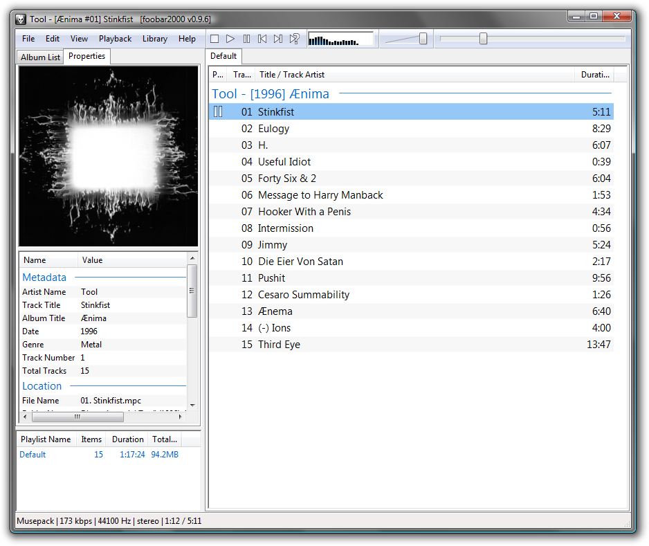
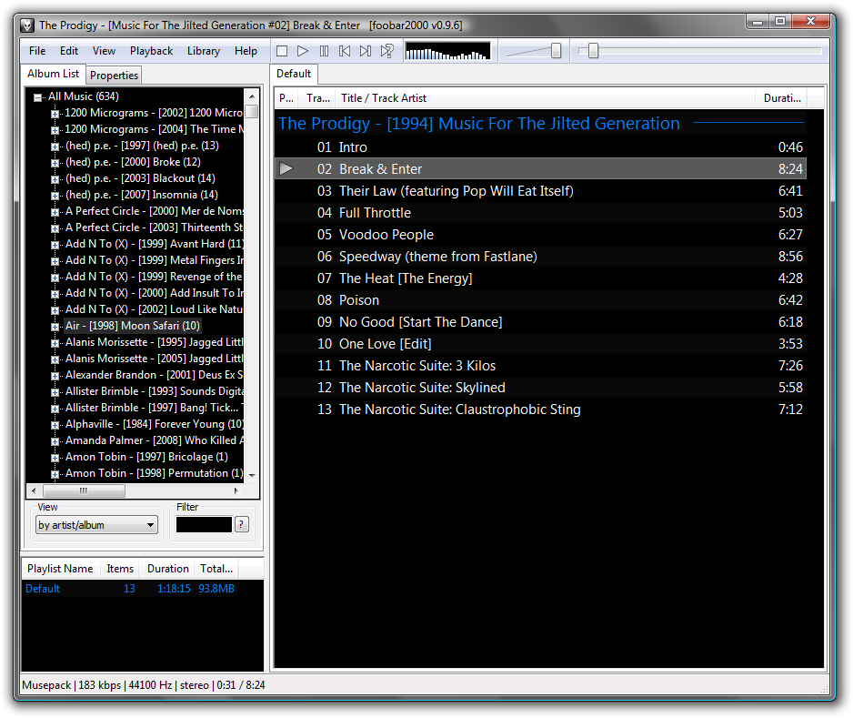
For power users, maybe. When I open a music player the first thing I'll do is search for something, and there's no search box at all here: https://www.foobar2000.org/images/img/main.png
I'm sure there is a way to search, but I think Foobar is maybe built for a different kind of user than Spotify, etc.
See that Filter box? That's a search that, within the scope of your music library, works better than Google's or Spotify's. It's an incremental search box (I believe web kids call that "Instant" nowadays?), that filters the album list by your search about as fast as you type.
I don't think it's built for "a different kind of user" - Spotify UI is pretty complex, because everything from search to managing playlists presents you with a pretty noisy UI that makes you click around a lot to find what you want and not click on what you don't want (Foobar never "suggests" you music it fully knows is not what you're searching for). Being a user of both - having switched to Spotify when it became easier than bringing an external drive full of MP3s to work - I can tell the basic UI interactions are of similar complexity, except Spotify is a bit more confusing at times.
Foobar's incremental search is such a useful feature I ditched Winamp for it back in the old days, and I still use it as a go-to example in product/UI development sessions.
> There was a huge UX regression coming with the move to the cloud.
Maybe in terms of the things you can click and knobs you can twiddle, but moving my music into Google Play and off (e.g.) iTunes means that I can very trivially put music on my mobile device (using either that device, or the computer) that is almost instantly accessible offline, and easy to listen to.
That twin gain - ease of sync and offline availability - completely blew Winamp and iTunes so far out of the water that they're in orbit, as far as I'm concerned.
(There are things I miss; multiple genres for a given song/album. Organizing by folder and playlist. Visualizations. Sometimes Google Play will forcibly replace my uploaded files with the wrong version - I still have a few songs that are "censored", and it grates me whenever I hear them.)
As somebody paying for Spotify, I agree. As somebody who had a MP3 collection on his disk in the 2000s, I disagree. Without doubt, my wifi connection should make it easy and fast to synchronize music between my laptop and smartphone. Nevertheless, "moving to the cloud" favours a centralized setup. Thankfully we see more decentralization on the horizon.
With music (and videos, and games) there's also another angle that I believe is in big part responsible for the success of Spotify and similar services: they provide an alternative between the only two options people had before - either spend a lot of money buying music in unwieldy formats, or acquire MP3s from copyright infringers.
I totally agree with you, there should be a self-hosted option. I'd love it if the Google Play API was sufficiently reverse-engineered to just install a modified version of their software to point to my own server.
I've asked for open-source/self-hosted solutions before, and a few people here responded. One of the solutions looks like it promises to do what I want, though I haven't had a solid chance to look at it: https://news.ycombinator.com/item?id=19555899
> I too hate gratuitous UI changes, but things need to keep evolving.
That's devolution in multiple ways. Your app is now tied to your subscription so there's no competition for best music app. The apps are now high latency bandwidth hogs that require a network connection. Your now held to ransom, stop paying us and you lose your entire music collection.
> I too hate gratuitous UI changes, but things need to keep evolving.
Do they? Once something is a tool that meets a need, should the default assumption be that any change can be justified by vague appeals to "evolving", or should there be some specific and defensible justification required beforehand?
In the 1950s, cars were made of steel and essentially designed to survive impacts by sacrificing the passengers. These days, they're identical fiberglass mice which fold up into a protective cocoon around their passengers on impact. You know how people drove cars in the 1950s? Steering wheels and some number of pedals. You know how people drive cars now? By calling an Uber, the drivers of which use steering wheels and some number of pedals.
So... why hasn't the fundamental UX of the automobile evolved in the past half-century?
The move to webapps meant that each app had to decide how their buttons would look like, what colors, fonts, and contrasts they’d use, how their workflows to do very similar things would be structured; when things were on the desktop the OS UI elements made all the decisions for you - it was the same gray buttons with black text in the same font on every app - the only difference would be whether the buttons were above or below the textbox...
Another reason is that apps need to look and behave roughly like what’s currently “in trend”, as users spend the majority of their time on the big players’ apps, and not “keeping up” will make your app seem outdated and untrustworthy; ie skeuomorphism was the thing when iOS first caught on, and then everyone had to make everything flat when material design caught on...
> DON'T FUCKING CHANGE THE INTERFACE
>
> Unless there is a very good reason, and I bet there isn't.
>
> I bought my first MacBook in 2007.
Apple changed one of the most common operations: double-clicking a folder to open it now (a) opens in the parent folder's window, and (b) rearranges the folder contents which I have carefully arranged for my own particular use of that particular folder ARRRRGGGGG.
They could at least have put an option somewhere for "Open folders the old way," but didn't.
Cmd-double-click does it the old way... unlike double-clicking on any other thing in the UI.
As a like-/counter-anecdote, I developed semiconductor CAD tools for 10 years, after spending 10 years using them. When they first started being developed with GUIs, GUI meant UI, and its oft-maligned sibling, UX, wasn't a term. In my learnings, Xt (XToolKit) started putting words and code behind the abstract patterns in the late 80's, but our tool usability suffered horribly as more and more (usually nonresizing) Athena widgets were crammed into every goddamn corner of the screen with microscopic b&w pixmaps. Because of the lack of distinction between UI & UX in the tool design process, tools were extremely challenging to navigate with each new feature-rich release.
One of my first tasks as a project manager in 2004 was to introduce the web concepts of UI/UX into what had become essentially commandlines converted to Tcl/Tk (after Xt we went to Tcl/Tk.. ugh).
First challenge was to convince the old timer CAD devs.
Once I was able to explain there the difference between UX and UI, it waslike a light went on over everyone's head: how you use it is different from what it looks like. I know, obvious now, but not 15 years ago. We spent 10 months really driving the new buzzword UX/UI in order to get buy-in for profiling how the top 3 existing CAD tools (formal verification, layout, and timing) were being used via instrumentation and interviews. We then proceeded to completely redesign the GUIs in Qt using a consistent set patterns, icons, and workflows.
Then we had to convince the old timer engineer users.
We put a lot of effort into classes to explain how to migrate, and holy shit did we get yelled at. So much "It worked fine before, why did you change it?!?!?!?" Uhh... because a feature you use 80% of the time required 5x more clicks to get to than a feature you used 20% of the time? FML. It got better, people liked it more on our follow ups months later. [The first product to use the new suite completed in 12 instead of 18 months and I personally believe it was due to the new tools being faster, but I'm biased, and it could have been a variety of factors.]
I agree with your point that it is frustrating as fuck when a UI/UX pattern changes, and it should not be done glibly. But I have also found myself getting angry at having to adapt to a new change that ultimately made me more productive, just because of my own inertia.
/shrugs/
PS. Ironically, as a sad end to this story: the GUI's my team made in the early/mid-2000's eventually bloated after 10 years in almost the same way the original AIX/Sparc GUI's I used in the early 90's did. New coders came on board, and new managers, and they just crammed new buttons into to the tools without thinking about the UX. That was ca 2010 when I left, so I don't know where they at today, but I did have a "the more the things change, the more they stay the same" moment!!
Fascinating! As somebody who uses that kind of software, old timer electrical engineers seem to be very very unforgiving to UI problems and even more unforgiving to any change for better or worse. I learned that while volunteering for UI/UX at horizon-EDA which aims to become a more usable kiCAD¹
I have never seen worse UX/UI than in electrical engineering tools and I worked a lot with 3D software. They are completely inconsistent with other software, often even with themselves. It often resembles the heating room of a 500 year old building were everybody added things but nobody deared to clean up the things that were already there.
My suffering as a user of such tools motivated me to change things for the better. I never got the idea behind resisting change in UI/UX. It seems to be rooted in the believe that change in UX always means change for the worse and never for good. Which is weird, because even someone like a carpenter is very much interested in the usability of their own tools.
Maybe the problem is that each change in the software means they have to adapt and this demands a certain adaptability, or a will to stay on top in a changing world. It certainly costs energy to do that.
> So much "It worked fine before, why did you change it?!?!?!?" Uhh... because a feature you use 80% of the time required 5x more clicks to get to than a feature you used 20% of the time? FML.
Well, they're not wrong because every other CAD tool simply rearranged the UI for no reason.
In addition, the problem with semiconductor CAD tools is that any feature which isn't used by everybody is effectively broken because it has zero users, to an engineering approximation. I wish my CAD tools had a "CAUTION: this feature was used N times in the last 180 days by all users of the tool where N < 10. Expect bugs".
Although, in terms of UX I've never understood why CAD tools don't use Pie menus--games adopted them eons ago. (Fusion 360 is the exception, and it's a wonderful breath of fresh air).
I'm really curious where you worked now, as I don't remember any of my VLSI CAD tools getting an effective UI makeover (and we used a lot of them). Although I'm pretty sure we skipped most Mentor tools.
>"CAUTION: this feature was used N times in the last 180 days by all users of the tool where N < 10. Expect bugs"
I doubt it would work, power users turn off tracking. Presumably you can't trust that the tracking will return only what they say it will (and not your internet history) but you can trust that opting to turn it off will turn it off.
> UX for laptops/desktops was solved in the early 2000. Everything else since then is just irrelevant bullshit.
Couldnt agree more. And yes this is part of also why i like using macOS. Things get changed for a reason - I may not agree but at least it is 'reason-able' changes.
had a good chuckle reading the OP article - some parts read like it was an article in TheOnion or a weekly read from The Register they were so funny.
Every time I spot "UX" in relation to something I use, I cringe. Not because I have anything against the idea of design, or good interfaces, or designing good interfaces. That is all great. The problem is that 99% of the time that the term "UX" shows up in connection with something I use, two things are going to happen:
1) I will have to relearn how to do something that I already was used to doing without even thinking;
2) Some feature or option is going to be removed.
The human brain is incredibly plastic and adaptable. Unless the interface is truly absurd, most people can get used to it and never give it a second thought again.
My number one (by far) request as a user:
DON'T FUCKING CHANGE THE INTERFACE
Unless there is a very good reason, and I bet there isn't.
I bought my first MacBook in 2007. Thankfully, Apple is one of the best behaved companies when it comes to not changing things for the sake of it, and part of the reason why I stick with them. I don't mention this out of some sort of fanboy-ism (I have no loyalty to corporations, I just buy shit I like). I mention it to make a more important point:
The UX of 2007 was absolutely fine, and if they would have made zero changes since then I would be perfectly happy. UX for laptops/desktops was solved in the early 2000. Everything else since then is just irrelevant bullshit.